Mobile-First Web Design That Passes Google's Tests and Converts Real Customers — Odessa, TX
59% of Your Website Traffic Is Coming From Phones Right Now — Is Your Site Ready for Them?
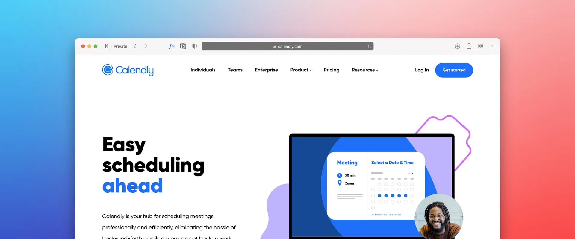
Google ranks the mobile version of your site. If it's broken, slow, or frustrating to use on a phone, you're invisible in search results. Ease Web Development builds every site mobile-first — and tests it on real devices before you ever see the bill.
Start Your Website Project Today
No pressure, no commitment — just expert advice.
Or call (432) 235-0561
TL;DR
Ease Web Development builds mobile-responsive websites in Odessa, TX using a mobile-first design methodology. Services include responsive layouts, Core Web Vitals optimization, touch-friendly interfaces, and PWA capabilities starting at $3,000 for Permian Basin businesses.
Mobile Is Not Optional — It's Where Your Customers Actually Are
Mobile devices account for approximately 59.4% of all global website traffic (Statista, 2024). In Odessa and across the Permian Basin, when someone searches for a plumber, a restaurant, or an auto shop, they're almost always on their phone. They're in the truck, they're at the job site, they're standing in a parking lot — and they're deciding in about five seconds whether to call you or call your competitor.
In 2023, Google completed its switch to mobile-first indexing for all websites. That means the mobile version of your site is what Google crawls and uses to determine your rankings. Your beautiful desktop site is irrelevant if the mobile version is a mess. Google drives 92.5% of global search traffic (Statcounter, 2024) — and they're judging you by your mobile experience.
Ease Web Development at 415 N Grant Ave, Odessa, TX builds every single site mobile-first by default. Not as an add-on. Not as an upgrade. As the starting point. Every site we build passes Google's mobile-friendly test with zero issues, because failing that test means losing the rankings your business depends on.
How We Actually Build Mobile-First — Not Just Marketing Language
Mobile-first isn't just a buzzword we put in proposals. It's a specific methodology that changes how we approach design from the first wireframe. Ease Web Development starts every layout at 375px width — the iPhone standard — designing the smartphone experience before we ever think about the desktop version. Content hierarchy, touch-friendly buttons, and readable typography are established at the smallest viewport first, then progressively enhanced for tablet (768px), laptop (1024px), and desktop (1440px).
Our layouts use CSS Grid and Flexbox for fluid, device-agnostic structures. Images use the srcset attribute and the picture element to serve appropriately sized files to each device — no sending a 2MB desktop image to someone on cellular data. Tap targets meet Google's recommended minimum of 48x48 CSS pixels so your mobile visitors aren't hunting for tiny buttons with their thumbs. Navigation collapses into accessible hamburger menus. Forms use correct input types (tel, email, number) so the right mobile keyboard appears automatically.
Ease Web Development tests every Odessa business website on real physical devices — actual iPhones, Samsung Galaxy units, iPads, and popular Android tablets. Not just browser emulators. Because sometimes things break on real devices that look perfect in a simulator.
Mobile Speed That Doesn't Lose Customers Before the Page Even Loads
Speed isn't a nice-to-have on mobile. It's a conversion requirement. According to Google's 2023 research, 53% of mobile users abandon a site that takes more than three seconds to load. On the 3G and 4G connections common in parts of the Permian Basin, unoptimized sites can take 10 seconds or more before they're even interactive. By that point, your visitor is already on your competitor's page.
Ease Web Development's mobile optimization stack includes: image compression to WebP format (25-34% smaller than JPEG, per Google), lazy loading for all below-the-fold content, critical CSS inlined to accelerate first paint, and JavaScript loaded with defer or async attributes to prevent render-blocking. We also implement service workers for offline caching and pre-fetching of likely next pages so the experience feels instantaneous.
Our target benchmarks are Google's Core Web Vitals: Largest Contentful Paint under 2.5 seconds, Interaction to Next Paint under 200 milliseconds, and Cumulative Layout Shift below 0.1. Ease Web Development monitors these metrics monthly through Google Search Console for every Odessa and Permian Basin client on a maintenance plan.
PWA and Advanced Mobile Technologies for Maximum Competitive Edge
Ease Web Development stays at the front of mobile web technology so your Permian Basin business doesn't get left behind. Progressive Web Apps (PWA) deliver app-like experiences directly in the mobile browser — no app store, no download required. We build PWA features including add-to-home-screen prompts, offline functionality, and push notifications for Odessa businesses that want deeper mobile engagement without the cost of a native app.
We implement AMP (Accelerated Mobile Pages) selectively for content-heavy pages and blog articles where loading speed is the absolute top priority, delivering near-instant load times for high-volume content. Every technology decision is made based on your specific business goals and what delivers the best return for your investment.
Mobile-responsive web design from Ease Web Development starts at $3,000 — and every site we build is mobile-first by default, no extra charge. Contact us at (432) 235-0561 or come see us at 415 N Grant Ave, Odessa, TX 79761. We'll do a free mobile performance audit of your current site and show you exactly what it's costing you.
Common Questions About Mobile Responsive Web Design
Need Mobile Responsive Web Design?
Ease Web Development helps Permian Basin businesses with professional mobile responsive web design. Get started with a free consultation today.